Logo refresh — 2026
Panacea Junkiez
An organic juice and smoothie bar in a small North Carolina town. Real character and a good product, held back by a dated, inconsistent look.
Client
Panacea Junkiez, Kinston, NC
TIER
1
Year
2026
The challenge
The name carries its own tension. “Panacea” reads wellness, “Junkiez” reads scrappy. The rebrand had to let each word keep its voice inside one polished, playful mark.
00
Before
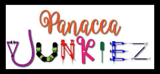
Deliverables — after
01
Logo variations
Variation 1
Variation 2
02
Color palette (3 to 5 core colors)
HUNTER GREEN
#2F5B3D
FLORAL WHITE
#FFFBF2
GOLDEN POLLEN
#FFCF3A
03
Two-font type system
Display
Aa
Headline font
Gineso - Condensed Demi
Body
Aa
Body font
Interstate - Condensed Regular
04
Condensed branding guide PDF
Panacea Junkiez — branding guide
PDF — link the file here
Next project